 |
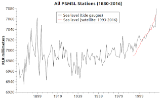
| Fig. 1a |
I. Satellite Data Added
 |
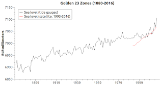
| Fig. 1b |
I have injected the NASA Satellite Records into the Test Case modules described earlier in this series (On The More Robust Sea Level Computation Techniques, 2, 3).
How this satellite usage works in general has explained previously (Syncronizing Satellite Data With Tide Gauge Data).
 |
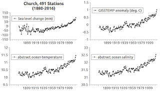
| Fig. 1c |
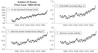
The graphs from the Test Case module (Fig. 1a thru Fig. 1c) are like the graphs in other modules.
II. Test Case Scenario
The three Test Case scenarios ('Golden 23', 'Church 491', and 'All Stations' were also discussed in previous posts of this series.
Basically, the three test cases are used to emphasize how important it is to select balanced world ocean areas when they are to be used as being representative of the whole of the oceans.
The satellite record (conformed to RLR concepts so as to match the PSMSL values) matches best with the Golden 23.
The graphs show that the Golden 23 evinces about twice the amount of sea level rise that the other two cases do.
How does "twice as much" set with the official record?
III. By The Numbers
 |
| Fig. 2a |
 |
| Fig. 2b |
 |
| Fig. 2c |
all stations:The Golden 23 numbers indicate about 197 mm (about 7.8 inches) of sea level rise during the graphed time frame.
103.339 mm * 361.841 = 37,392 (37392.287099) cu km
103.339 mm ÷ 304.8 mm = .34 (0.339038714) ft.
total: 4.07 (4.068464567) in.
Church 491:
93.7412 mm * 361.841 = 33,919 (33919.4095492) cu km
93.7412 mm ÷ 304.8 mm = 0.31 (0.307549869) ft.
total: 3.7 (3.690598425) in.
Golden 23:
197.136 mm * 361.841 = 71,332 (71331.887376) cu km
197.136 mm ÷ 304.8 mm = 0.65 (0.646771654) ft.
total: 7.8 (7.761259843) in.
That comports well with the NASA estimation that "sea level has risen about eight inches since the beginning of the 20th century" (NASA, emphasis added).
The other two test case scenarios indicate about half of that Golden 23 amount, so we can discount them because the test case indicates that they are not produced from a balanced group of tide gauge, weather, or WOD stations and zones.
To produce those numbers, I use "361.841" as the cubic kilometers of ocean water required to raise the global mean average of sea level one millimeter; I use "304.8" as the number of millimeters per foot.
The Golden 23 sea level, then, indicates that an increase of 71,332 cu. km. of ocean water was added by Cryosphere melting during the graph time frame.
Again, the other two indicate about half of that amount.
IV. Back To Ocean Water Temperatures
 |
| Fig. 3a |
 |
| Fig. 3b |
 |
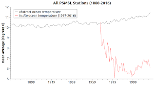
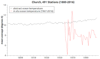
| Fig. 3c |
This is the toughest case to solve.
For starters, it is not axiomatic that the zones where tide gauge stations have been installed and working for centuries in some cases, decades in other cases, will have the same warming of waters as sea level change.
There is no direct link at the latitude / longitude location between warming waters and sea level rise or fall.
That is because a lot of the water comes from far away when released by ice sheets as they lose their gravity (The Gravity of Sea Level Change, 2, 3, 4).
Likewise, the melt water also flows toward the equator (ibid).
Furthermore, the World Ocean Database is composed of uneven depth measurements as well as uneven latitude / longitude measurements.
The graphs at Fig. 3a thru Fig. 3c show that the in situ measurements (actual measurements at actual locations) vary based on measurement location, and are at odds with the expected Test Case temperatures.
V. Conclusion
I am going to do some examination of my portion of the WOD database (~1 billion measurements) to see if there is a collection of WOD zones that are closer to the Test Case scenario (even if they are outside of the Golden 23).
Additionally, I intend to explore whether I should add some other datasets to the mix (I currently use only the CTD and PFL datasets).
I will inform readers of that progress in future posts.
The previous post in this series is here.